Fonts and images often have licensing options, which means - how you are going to use them, and how many times you're going to use them. For instance, if you are only going to use a stock image on a small print run job it will cost you less than it will for a large print run job.
FONTS -
Fonts can be found on a number of websites. One that I use regularly is www.dafont.com, here you can search for a number of styles of fonts. They are almost all free fonts, with an option to donate to the author. The smart authors combine a read-me document in their files that you download, which state their terms and conditions. Here it often says that the font is free for personal use and if you wish to use it for commercial purposes you must contact the author and receive permission. That is all well and good for these fonts which are often "home made" but for fonts that are crafted by well known designers, professional typeface designers, there is often a fee involved and more strict terms and conditions.
"Font Font - The world's largest library of original contemporary typefaces" is just one of the places you can find these types of type (ha!)
 | |
|
 |
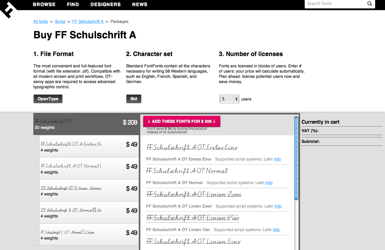
| Screen shot - Showing file format, character set options and number of licenses.Here the number of licenses is 1000, obviously the price goes up quite a bit. |
Once you have decided how many licenses you need, you can buy your font, agree to the EULA and proceed to download the fonts immediately once payment has cleared.
This is just an example of one company and how they control the licensing agreements. It's always best to double check the term and conditions on each website.
A great article to help any business out is http://tinyurl.com/3czkark The Eight Golden Rules of Font Licensing. Check out the comments too!
IMAGES - Stock images work similarly to font licensing. One website where you can find great stock photography is www.iStockphoto.com. Images are paid for with credits which you purchase online. Once you pay for the images they are ready to download. Other sites such as Getty Images prefer you to pay online - the photo you are after goes into your shopping cart and then you proceed to the check out where you pay online via credit card etc. The price goes up depending on the size you buy. Getty Images offer a variety of options for the business savvy. There are "Royalty Free" images which allow you to purchase the license for an image and then you can use it as many times as you wish, however you wish. Then there are "Rights Managed" images which offer more exclusivity and have more restrictions on the usage.
It's hard to constantly make sure you are doing the right thing by the original creators of work, but most reputable companies or websites will have terms and conditions to explain how they expect their work to be used. And as designers ourselves we must respect the work and effort that has gone into creating a resource for us to use.
To be safe rather than sorry - original work is your best bet!


